Average vs. Maximum in Metrics Charts
Many resource limitations and other issues can't be seen when using visualization that aggregate data using averages.
Though averages are useful, they don't let you see peaks. The CPU usage charts below show an example.
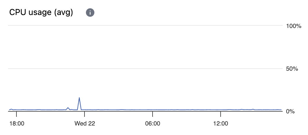
A chart of average CPU usage.
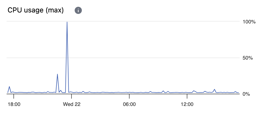
A chart of maximum CPU usage created from the same raw data.
Aggregation of Raw Data Points
Regardless of the monitoring tool you use, when you view a time-series chart, you generally aren't viewing the raw data points that were collected. Charts showing raw data points are often useless and impractical.
Charts of raw data points are often useless because, for example, the normal and large variations between successive data points would create such a mass of nearly-vertical connected lines that you wouldn't be able to see any meaningful information. Additionally, charts of raw data points are often impractical because of the huge number of data points that need to be rendered. The larger the time range being viewed, the more drastic each of these problems become.
To turn large numbers of raw data points into useful visualizations, the full time range covered by the raw data is split into many small time windows. The raw data points within each small time window are aggregated into a single data point. How the raw data in each small time window is aggregated impacts the overall meaning of the resulting chart.
Though aggregation is often a practical requirement, it is not a crutch. As the purpose of any data visualization is to help one understand the data, aggregation is another tool for making data visualizations meaningful. The type of aggregation used determines the meaning of the resulting visualization.
Aggregation Using Average Values
A chart such as "CPU Usage (avg)" that calculates average values when aggregating raw data samples is great at showing overall trends.
However, in charts showing averages, peak values will be lost.
Aggregation Using Maximum Values
A chart such as "CPU Usage (max)" that calculates maximum values when aggregating raw data samples is perfect for showing peaks.
Using Both Aggregations: Average and Maximum
In many cases, it's helpful to have both types of charts available: charts that show average values and charts that show maximum values. The further you "zoom out" when viewing time series charts, the greater the difference will be between the two charts.