
Read and understand metrics charts
How data aggregation works
Time series charts used in infrastructure monitoring usually don’t display the raw data points that were collected. Charts showing raw data points are often not useful due to the large variations between successive raw data points. Additionally, charts of raw data are often impractical due to the huge number of data points that need to be rendered.
To turn raw time series data into data that is useful for visualization, raw data points are aggregated into a smaller set of data points through the following two-step process:
- The full time range covered by the raw data is split into many small time windows.
- The raw data within each time window is aggregated into a single data point.
The most common algorithms used for data aggregation are:
- Average value — The average value of the raw data within each time window is used as the value of the generated data point for that time window.
- Maximum value — The maximum value of the raw data within each time window is used as the value of the generated data point for that time window.
The algorithm used to aggregate the raw data impacts the meaning of the chart.
Average vs. maximum in charts
Many resource limitations and other issues can’t be seen when using visualization that aggregate data using only averages. Averages don’t let you see peaks. A peak that happened for a short period of time relative to the size of the data aggregation window will not impact the average value significantly.
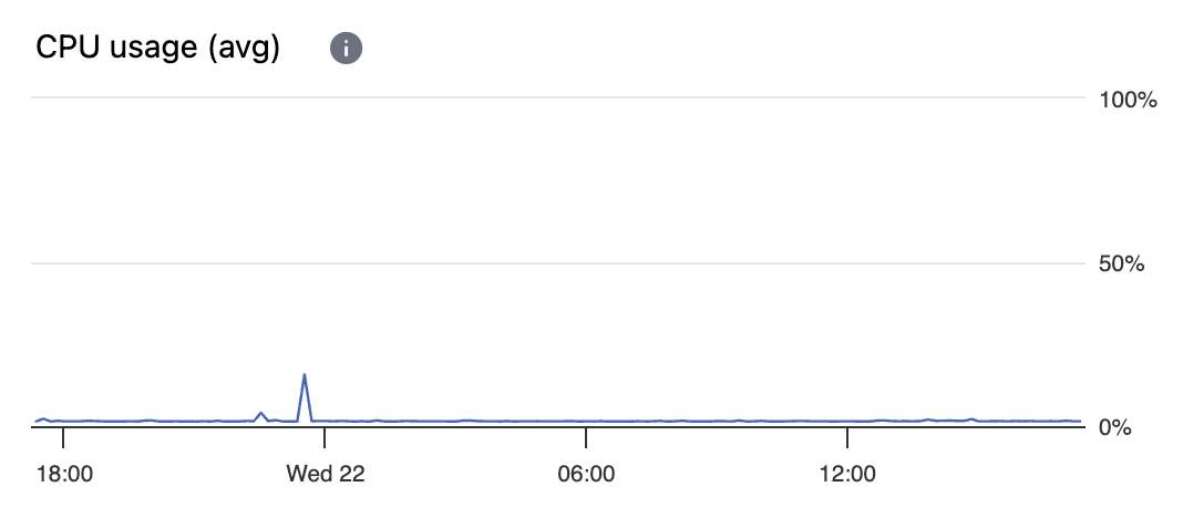
A chart of average CPU usage.
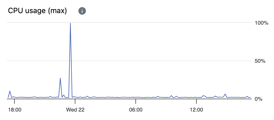
A chart of maximum CPU usage created from the same raw data.
A chart such as “CPU Usage (avg)” that calculates average values when aggregating raw data points is great at showing overall trends. However, in charts showing average values, peak values can’t be seen.
A chart such as “CPU Usage (max)” that calculates maximum values when aggregating raw data points is perfect for showing peaks. However, in charts showing maximum values, the overall trends can’t be seen when short peaks are common.
It’s often helpful to have both types of charts available: charts that aggregate using average values and charts that aggregate using maximum values.